
💌 所属专栏:【微信小程序开发教程】
😀 作 者:我是夜阑的狗🐶
🚀 个人简介:一个正在努力学技术的CV工程师,专注基础和实战分享 ,欢迎咨询!
💖 欢迎大家:这里是CSDN,我总结知识的地方,喜欢的话请三连,有问题请私信 😘 😘 😘
文章目录
- 前言
- 一、自定义 tabBar
- 1、案例效果
- 2、实现步骤
- 3、渲染 tabBar 上的数字徽标
- 4、实现tabBar 页面切换效果
- 5、修改 tabBar 选中项文本的颜色值
- 总结
前言
大家好,又见面了,我是夜阑的狗🐶,本文是专栏【微信小程序开发教程】专栏的第46篇文章;
今天开始学习微信小程序的第28天💖💖💖,开启新的征程,记录最美好的时刻🎉,每天进步一点点。
专栏地址:【微信小程序开发教程】, 此专栏是我是夜阑的狗微信小程序开发过程的总结,希望能够加深自己的印象,以及帮助到其他的小伙伴😉😉。
如果文章有什么需要改进的地方还请大佬不吝赐教👏👏。
一、自定义 tabBar
前面已经介绍了分包-独立分包 & 分包预下载,通过栗子学习了如何设置独立分包以及分包预下载。接下来就来根据前面学的知识,在案例 - 自定义 tabBar上进行实践。话不多说,让我们原文再续,书接上回吧。

1、案例效果
首先来看一下页面演示效果,页面中有下方标签栏是自定义 tabBar。自定义 tabBar 可以让开发者更加灵活地设置 tabBar 样式,以满足更多个性化的场景。

在此案例中,用到的主要知识点如下:
- 自定义组件
- Vant 组件库
- MobX 数据共享
- 组件样式隔离
- 组件数据监听器
- 组件的 behaviors
- Vant 样式覆盖
2、实现步骤
首先来实现 tabBar 标签栏,自定义 tabBar 可分为 3 大步骤,分别是:
- Step 1、配置信息
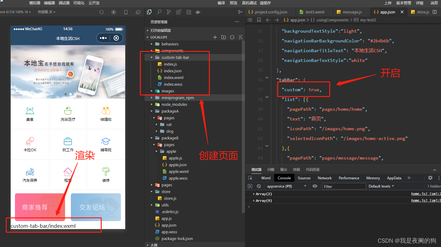
在 app.json 中的 tabBar 项指定 custom 字段,同时其余 tabBar 相关配置也补充完整。所有 tab 页的 json 里需声明 usingComponents 项,也可以在 app.json 全局开启。
app.json
{ "tabBar": { "custom": true, "list": [{ "pagePath": "pages/home/home", "text": "首页", "iconPath": "/images/home.png", "selectedIconPath": "/images/home-active.png" },{ "pagePath": "pages/message/message", "text": "消息", "iconPath": "/images/message.png", "selectedIconPath": "/images/message-active.png" },{ "pagePath": "pages/contact/contact", "text": "联系夜阑", "iconPath": "/images/contact.png", "selectedIconPath": "/images/contact-active.png" }] },}注意:当配置自定义 tarBar 页面时,list 属性不能删除,为了保证低版本兼容以及区分哪些页面是 tab 页,tabBar 的相关配置项需完整声明,但这些字段不会作用于自定义 tabBar 的渲染。
- Step 2、添加 tabBar 代码文件
在代码根目录下添加入口文件,这里的文件夹名一定是 custom-tab-bar,然后在创建 index 组件(index命名也不能随便改,就用 index,否则无法识别)。
当 custom 参数为 true 时,小程序就会自动识别 custom-tab-bar 里面的文件,并将其渲染出来。
- Step 3、编写 tabBar 代码
用自定义组件的方式编写即可,该自定义组件完全接管 tabBar 的渲染。另外,自定义组件新增 getTabBar 接口,可获取当前页面下的自定义 tabBar 组件实例。这里使用 Vant Weapp 底部导航栏,用于在不同页面之间进行切换。
1、引入
在 app.json 或 index.json 中引入组件,这里对组件进行全局引用,具体代码如下所示:
app.json
{ "usingComponents":{ "my-test1": "/components/test1/test1", "my-test2": "/components/test2/test2", "my-test3": "/components/test3/test3", "my-test4": "/components/test4/test4", "my-test5": "/components/test5/test5", "van-button": "@vant/weapp/button/index", "my-numbers": "./components/numbers/numbers", "van-tabbar": "@vant/weapp/tabbar/index", "van-tabbar-item": "@vant/weapp/tabbar-item/index" },}2、基础用法
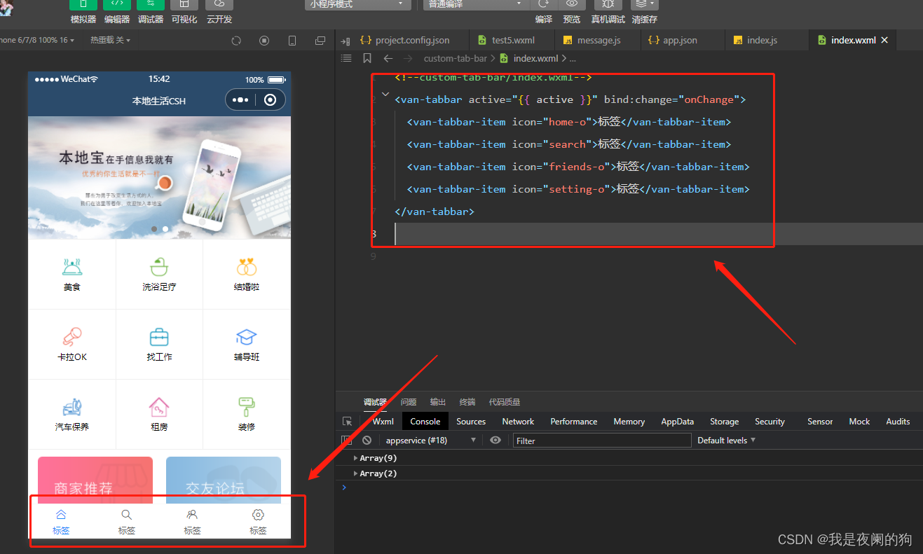
index.wxml
<van-tabbar active="{{ active }}" bind:change="onChange"> <van-tabbar-item icon="home-o">标签</van-tabbar-item> <van-tabbar-item icon="search">标签</van-tabbar-item> <van-tabbar-item icon="friends-o">标签</van-tabbar-item> <van-tabbar-item icon="setting-o">标签</van-tabbar-item></van-tabbar>index.js
Component({ /** * 组件的初始数据 */ data: { active: 0, }, /** * 组件的方法列表 */ methods: { onChange(event) { // event.detail 的值为当前选中项的索引 this.setData({ active: event.detail }); }, }})可以来看一下运行效果:
3、自定义图标
知道怎么引用 Vant 组件之后,接下来就根据需求来对其进行修改,可以通过 slot 自定义图标,其中 icon slot 代表未选中状态下的图标,icon-active slot 代表选中状态下的图标。来看一下 vant 提供的参数 TabbarItem Slot:
| 名称 | 说明 |
|---|---|
| icon | 未选中时的图标 |
| icon-active | 选中时的图标 |
index.wxml
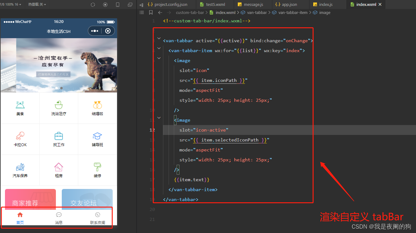
通过 wx: for 将标签栏渲染到页面上。
<van-tabbar active="{{active}}" bind:change="onChange"> <van-tabbar-item wx:for="{{list}}" wx:key="index"> <image slot="icon" src="{{ item.iconPath }}" mode="aspectFit" style="width: 25px; height: 25px;" /> <image slot="icon-active" src="{{ item.selectedIconPath }}" mode="aspectFit" style="width: 25px; height: 25px;" /> {{item.text}} </van-tabbar-item></van-tabbar>index.js
将 app.json 里的 list 数组放在自定义 tabBar 组件中的 data 数据,然后通过循环渲染到页面上。
Component({ /** * 组件的初始数据 */ data: { active: 0, "list": [{ "pagePath": "pages/home/home", "text": "首页", "iconPath": "/images/home.png", "selectedIconPath": "/images/home-active.png" },{ "pagePath": "pages/message/message", "text": "消息", "iconPath": "/images/message.png", "selectedIconPath": "/images/message-active.png" },{ "pagePath": "pages/contact/contact", "text": "联系夜阑", "iconPath": "/images/contact.png", "selectedIconPath": "/images/contact-active.png" }] }, /** * 组件的方法列表 */ methods: { onChange(event) { // event.detail 的值为当前选中项的索引 this.setData({ active: event.detail }); }, }})此时可以看到已经成功把 list 数组里的图片都渲染出来了,来看一下运行效果:
详细步骤,可以参考小程序官方给出的 文档 。
3、渲染 tabBar 上的数字徽标
- 渲染数字徽标
通过 van-tabbar-item 上 info 属性可以对 tabBar 渲染数字,具体代码如下所示:
index.wxml
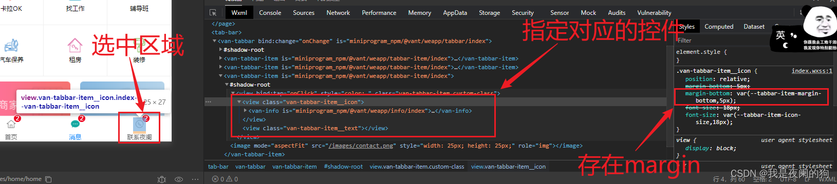
<van-tabbar active="{{active}}" bind:change="onChange"> <van-tabbar-item wx:for="{{list}}" wx:key="index" info="2"> <image slot="icon" src="{{ item.iconPath }}" mode="aspectFit" style="width: 25px; height: 25px;" /> <image slot="icon-active" src="{{ item.selectedIconPath }}" mode="aspectFit" style="width: 25px; height: 25px;" /> {{item.text}} </van-tabbar-item></van-tabbar>可以看当对 tabBar 加上数字徽标时,就溢出 tabBar 页面范围。此时需要美化 tabBar 页面, 通过调试器可以看到,图标与标签名中间有间隔。

在网页开发中,橘黄色的部分代表 margin 。
- 美化样式
从上图可以发现,margin-bottom: var(--tabbar-item-margin-bottom,5px);,其中 var 是css中用来引用变量的,当 --tabbar-item-margin-bottom 不存在的时候,就默认为 5px。所以只要重置其 margin-bottom 的值,数字徽标就不会超出 tabBar 范围。
index.wxss
.van-tabbar-item{ --tabbar-item-margin-bottom: 0,}注意:在自定义组件中使用 Vant Weapp 组件时,需开启 styleIsolation: ‘shared’ 选项
index.js
Component({ options: { styleIsolation: 'shared', },});可以来看一下运行效果:

- 按需添加数字徽标
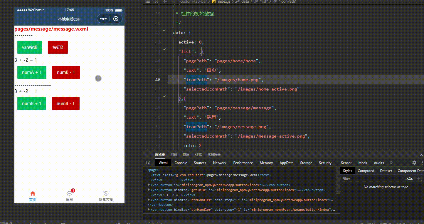
在实际开发过程中,并不是所以图标都需要添加数字徽标的,所以不能 info 属性将其写死。这里需要把 store 里面的数据绑定组件中进行使用,然后通过数据监听器将数据变化传到数字图标上,具体代码如下所示:
index.wxml
通过判断是否有 info 属性来显示该数字图标,当 info 属性不存在或者为 0 的时候都不显示。
<van-tabbar active="{{active}}" bind:change="onChange"> <van-tabbar-item wx:for="{{list}}" wx:key="index" info="{{item.info ? item.info : ''}}"> <image slot="icon" src="{{ item.iconPath }}" mode="aspectFit" style="width: 25px; height: 25px;" /> <image slot="icon-active" src="{{ item.selectedIconPath }}" mode="aspectFit" style="width: 25px; height: 25px;" /> {{item.text}} </van-tabbar-item></van-tabbar>index.js
在消息图标后添加 info 属性。
// custom-tab-bar/index.js// 导入import {storeBindingsBehavior} from 'mobx-miniprogram-bindings'import {store} from '../store/store'Component({ // 挂载 behaviors: [storeBindingsBehavior], // 全局数据操作 storeBindings: { store, fields:{ sum: 'sum' }, actions: {} }, // 数据监听 observers:{ "sum": function (value){ this.setData({ "list[1].info": value }) } }, /** * 组件的初始数据 */ data: { active: 0, "list": [{ "pagePath": "pages/home/home", "text": "首页", "iconPath": "/images/home.png", "selectedIconPath": "/images/home-active.png" },{ "pagePath": "pages/message/message", "text": "消息", "iconPath": "/images/message.png", "selectedIconPath": "/images/message-active.png", info: 2 },{ "pagePath": "pages/contact/contact", "text": "联系夜阑", "iconPath": "/images/contact.png", "selectedIconPath": "/images/contact-active.png" }] },})可以看到对全局数据进行操作时,消息的数字徽标也会随着变化,运行效果如下所示:
4、实现tabBar 页面切换效果
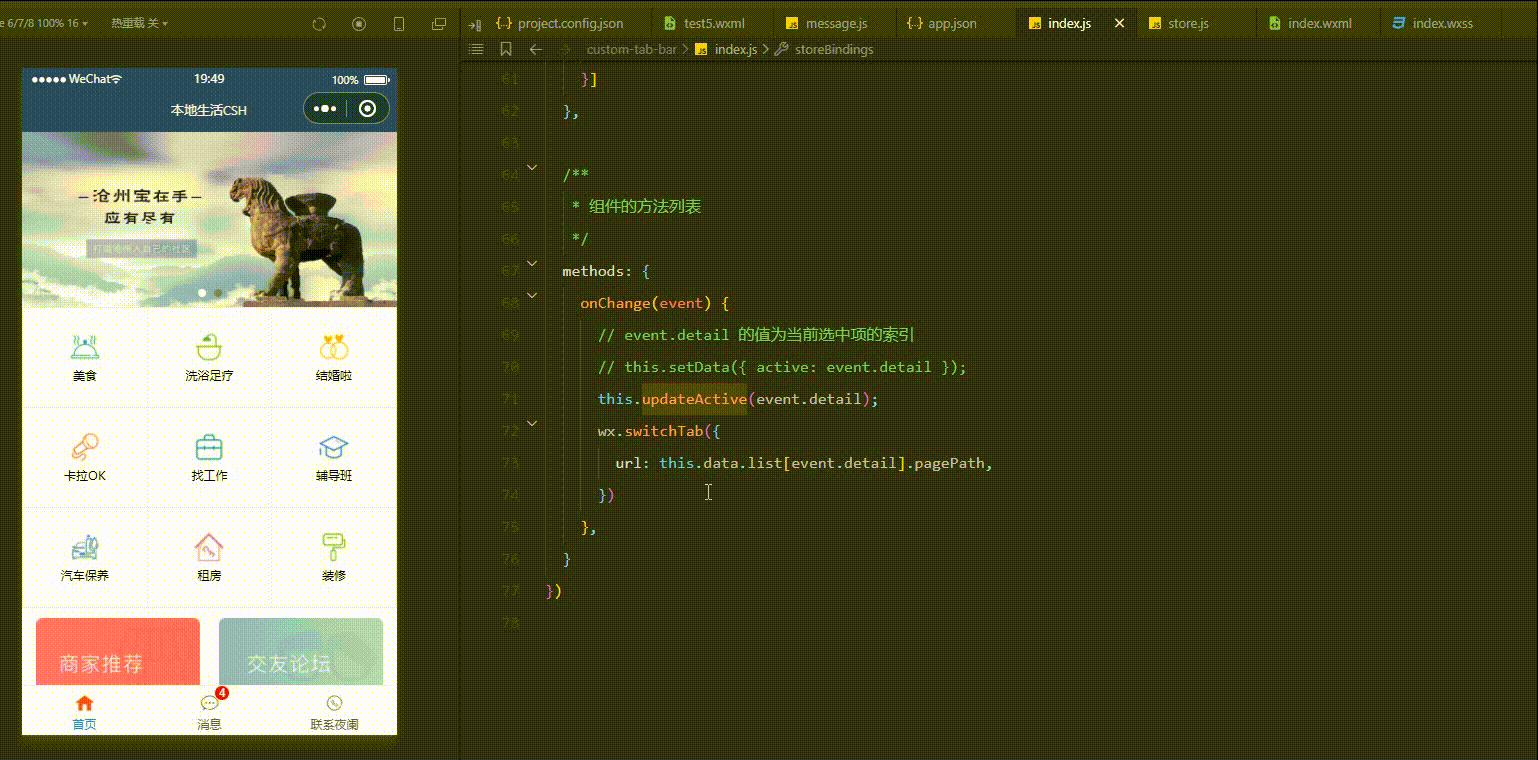
通过监听 tabBar 的 change 事件,得到当前选中项的索引,根据这个索引找到对应页面路径,最后用 wx.switchTab 进行页面跳转。
store.js
不用在组件data 里面定义选中项的索引,不然会出现问题(坑点),最好定义在 store 中,先在 store 定义变量和修改方法。
export const store = observable({ // 需要挂载的数据 -- 数据字段 numA: 1, numB: 3, name: "我是夜阑的狗", activeTabBarIndex: 0, // 计算属性 -- get为修饰符 get sum(){ return this.numA + this.numB; }, // actions 函数,专门来修改 store 中数据的值 updateNum1: action(function(step){ this.numA += step; }), updateNum2: action(function(step){ this.numB += step; }), updateName: action(function(name){ this.name = name; }), updateActiveTabBarIndex: action(function(index){ this.activeTabBarIndex = index; })})index.js
将全局数据里的索引变量和修改方法挂载到组件中。
// custom-tab-bar/index.js// 导入import {storeBindingsBehavior} from 'mobx-miniprogram-bindings'import {store} from '../store/store'Component({ // 挂载 behaviors: [storeBindingsBehavior], // 全局数据操作 storeBindings: { store, fields:{ sum: 'sum', active: 'activeTabBarIndex' }, actions: { updateActive: 'updateActiveTabBarIndex' } }, /** * 组件的方法列表 */ methods: { onChange(event) { // event.detail 的值为当前选中项的索引 // this.setData({ active: event.detail }); this.updateActive(event.detail); wx.switchTab({ url: this.data.list[event.detail].pagePath, }) }, }})注意:这里页面路径 一定要以斜线根路径开头,否则无法识别。
可以来看一下运行效果:
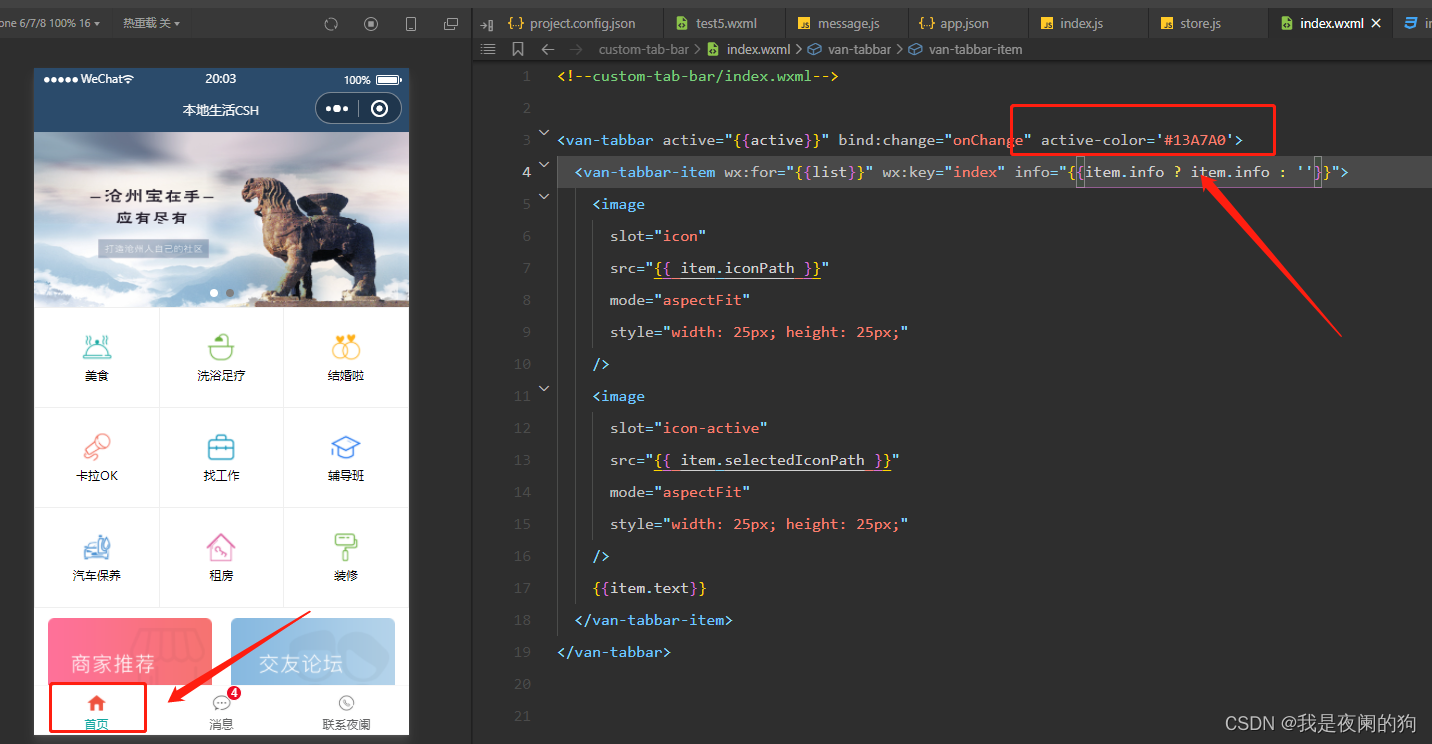
5、修改 tabBar 选中项文本的颜色值
最后就是来修改 tabBar 选中项文本的颜色值,来看一下 Vant 提供 tabBar 参数 Tabbar Props :
| 参数 | 说明 | 类型 | 默认值 |
|---|---|---|---|
| active | 当前选中标签的索引 | number | - |
| fixed | 是否固定在底部 | boolean | true |
| placeholder | 固定在底部时,是否在标签位置 生成一个等高的占位元素 | boolean | false |
| border | 是否展示外边框 | boolean | true |
| z-index | 元素 z-index | number | 1 |
| active-color | 选中标签的颜色 | string | #1989fa |
| inactive-color | 未选中标签的颜色 | string | #7d7e80 |
| safe-area-inset-bottom | 是否为 iPhoneX 留出底部安全距离 | boolean | true |
index.wxml
<van-tabbar active="{{active}}" bind:change="onChange" active-color='#13A7A0'> <van-tabbar-item wx:for="{{list}}" wx:key="index" info="{{item.info ? item.info : ''}}"> <image slot="icon" src="{{ item.iconPath }}" mode="aspectFit" style="width: 25px; height: 25px;" /> <image slot="icon-active" src="{{ item.selectedIconPath }}" mode="aspectFit" style="width: 25px; height: 25px;" /> {{item.text}} </van-tabbar-item></van-tabbar>可以来看一下运行效果:
总结
感谢观看,这里就是案例 - 自定义 tabBar的介绍,如果觉得有帮助,请给文章点个赞吧,让更多的人看到。🌹 🌹 🌹

也欢迎你,关注我。👍 👍 👍
原创不易,还希望各位大佬支持一下,你们的点赞、收藏和留言对我真的很重要!!!💕 💕 💕 最后,本文仍有许多不足之处,欢迎各位认真读完文章的小伙伴们随时私信交流、批评指正!下期再见。🎉
更多专栏订阅:
- 😀 【LeetCode题解(持续更新中)】
- 🚝 【Java Web项目构建过程】
- 💛 【微信小程序开发教程】
- ⚽ 【JavaScript随手笔记】
- 🤩 【大数据学习笔记(华为云)】
- 🦄 【程序错误解决方法(建议收藏)】
- 🚀 【软件安装教程】
订阅更多,你们将会看到更多的优质内容!!